
Account, plans and billing
Accessibility
Switch to a dyslexia-friendly font, larger text, wider spacing or high contrast.
Accessibility settings change how text looks across the app so long notes and PDFs are easier to read. Changes apply right away, with no reload.
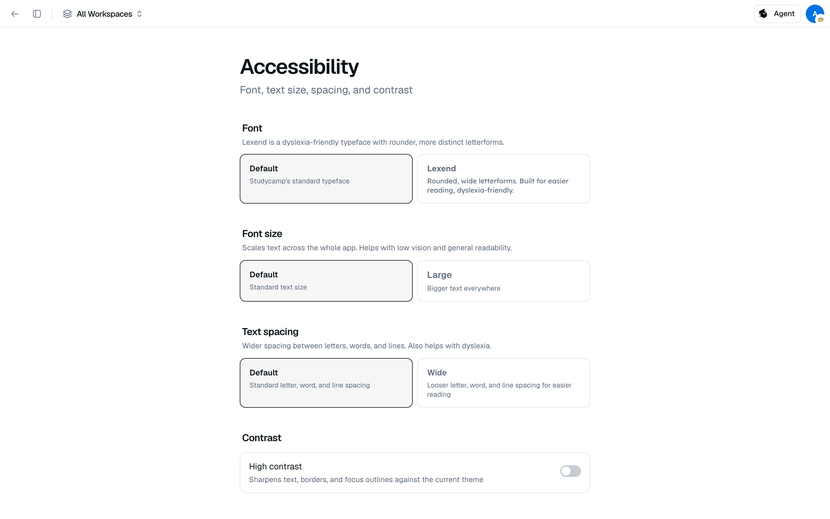
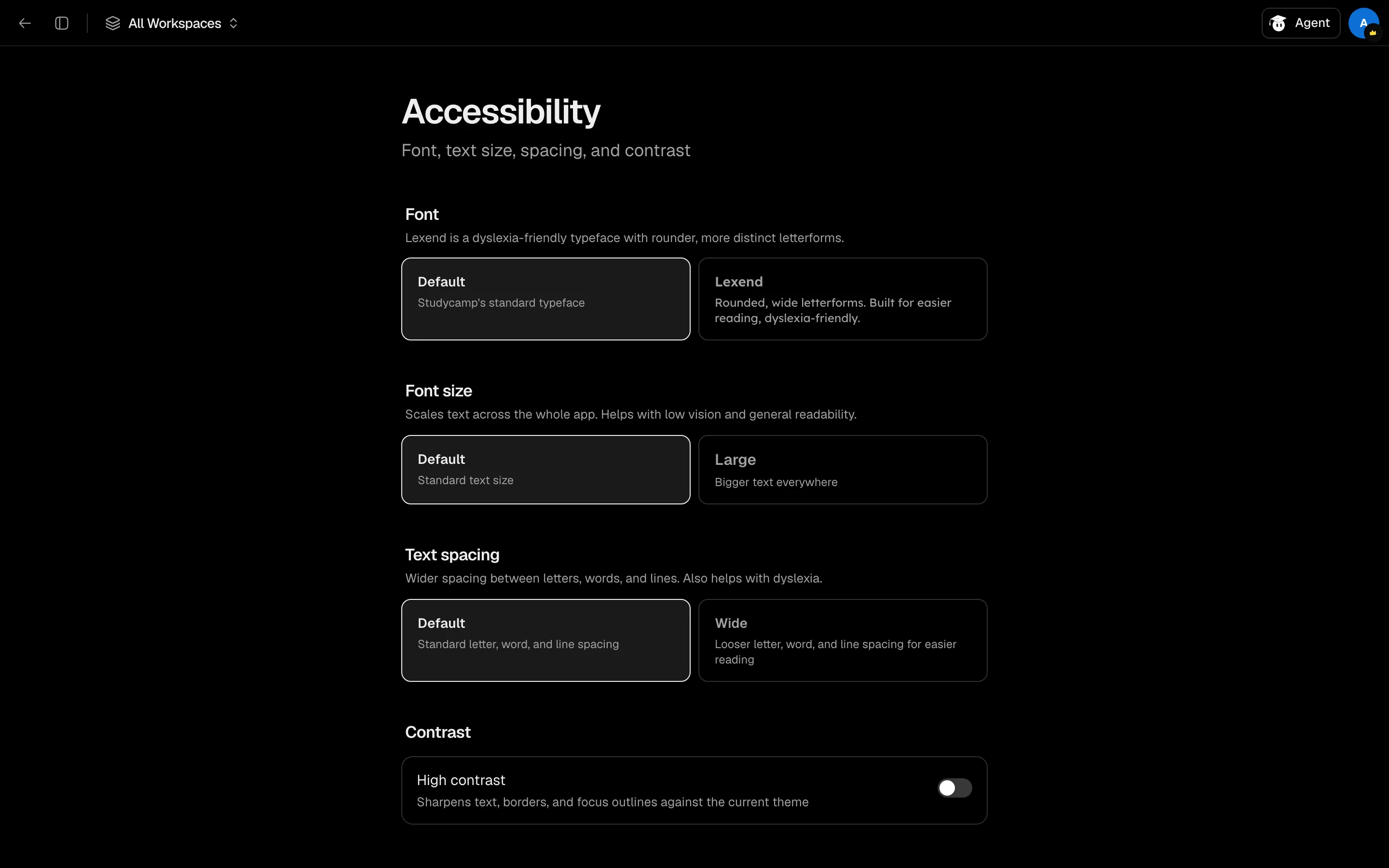
Change how text looks
- Open Settings, then Accessibility.
- Pick the options you want.
| Setting | Options |
|---|---|
| Font | Default, or Lexend, a rounded typeface designed for easier reading and dyslexia-friendly. |
| Font size | Default or Large. Scales text across the whole app. |
| Text spacing | Default or Wide. Looser letter, word and line spacing. |
| High contrast | On or off. Sharpens text, borders and focus outlines against your current theme. |
High contrast works with Light, Dark or System. Set those under Appearance, see Settings.
These settings are saved in your browser. Set them again on each browser or device you use.